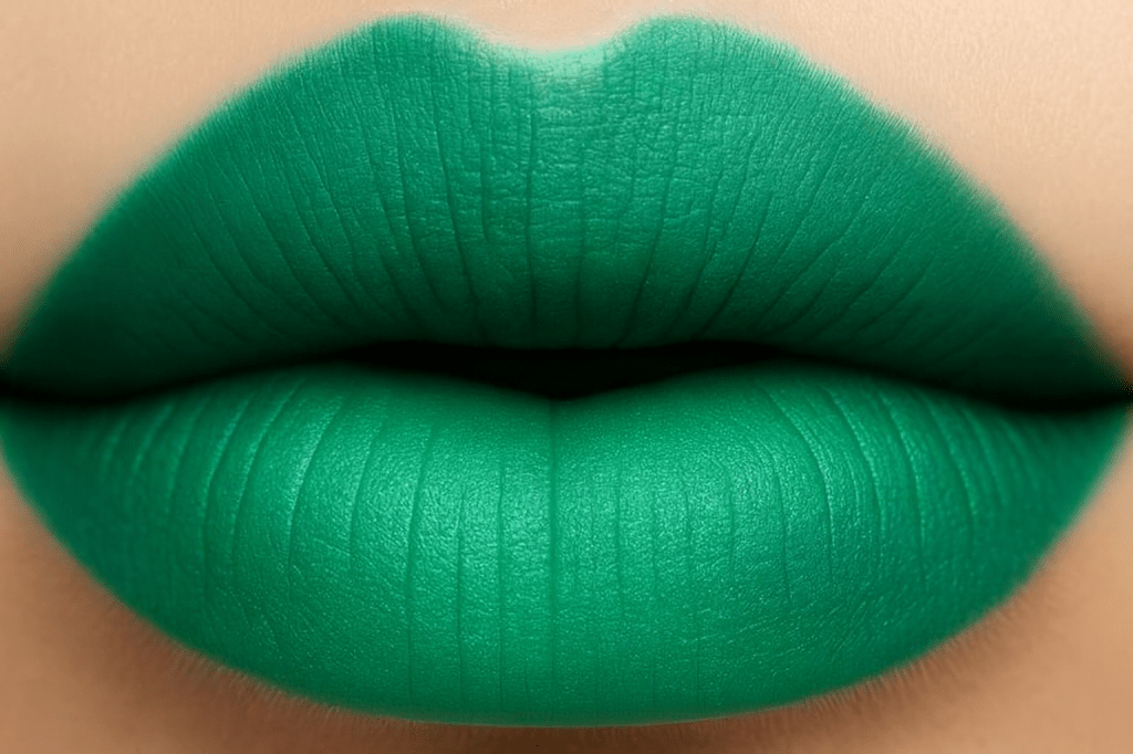
If confidence had a color, it would be emerald. Emerald isn’t just a shade in the green family, it’s a green with a secret. It’s the color of the queens’ velvet robe who knows her worth. This Color Crush Series blog is all about history, richness in hue, emotion, and unapologetic presence. Emerald doesn’t ask for attention, it commands it softly but with attitude.
Emerald green, also known as Paris green, Veronese green, or Schweinfurt green, was first commercially produced in 1814 in Schweinfurt, Germany by Wilhelm Sattler. It was created to be a better version of Scheele’s green, using copper acetoarsenite which was a compound mix of copper acetate, vinegar, and white arsenic. The result being a beautiful brilliant rich deep green that has unmatched vibrancy, especially when used in oil and watercolor painting. Emerald green has been used abundantly in art and design. In the 19th century artists used it for its luminosity and richness. It has appeared in Romanesque murals, Victorian wallpapers, and fashion fabrics for the royals.
A less known fact at the time is how deadly it was. Its arsenic content was highly toxic and when damp it would release poisonous fumes which are speculated to have contributed to many deaths. Napoleon possibly being one of them for his wide use of the emerald wallpaper. The toxicity of the pigments wasn’t revealed until 1822. Despite its dangers though, emerald green remained popular because it was so cheap to produce, fashionable, and difficult to replicate with other pigments. It couldn’t be mixed with sulfur containing pigments like cadmium yellow or ultramarine as it would turn brown or black. Eventually its use declined because of the toxicity and was replaced with safer synthetic colors like Winsor Emerald.
Emerald green can be part of a wide arrangement for an emotional palette. It pairs beautifully with a soft pink blush and shows vulnerability with grace. It pairs great with gold for a bold showing or empowerment with elegance. It also pairs great with charcoal or other greys for grounded boundaries. If you pair it with a plum, it can evoke depth and mystery. You could even go with a burnt orange to add some seasonal warmth and sass to your wardrobe. Emerald green is a color that holds space for both softness and strength.
Emerald green is named after the emerald gemstone which has been revered since ancient times for its lush deep vibrant hues. Today Emerald green is used widely in interior design, fashion, branding, etc. It symbolizes luxury, growth, and renewal. Emerald is typically a color used in growth but not the messy chaotic kind. It’s more of a curated, boundary, peaceful, and fulfilling growth. The kind that says, “You’re blooming but not about to be pruned.” Emerald is also a color for emotional boundaries that feel like silk lined armor. It’s a hue of self-trust, choosing depth over drama, of knowing that richness doesn’t mean excess, it means intention.
XOXO,
Savi Monroe
