As someone who absolutely loves all colors, I really don’t have one I dislike, I’m always on edge waiting for Pantone to pick their color of the year. After some research and compiling what scientists and fashionistas have to say, here is what I think is coming in 2026. I think 2026 is the year we come home to ourselves. Color trends across interiors, fashion, and emotional branding are leaning into grounded elegance, nature, and a quiet kind of confidence.
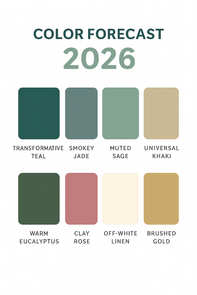
Green is going to be a new power neutral. 2026 is going to be less about shock factor and more about subtle impact. I think greens will be dominants and not just the usual accents we see them play. Think transformative teal, which is predicted to be Pantone’s new color of the year. It’s a rich blue green that evokes ocean depth and spiritual clarity. It’s showing up in statement outerwear, rich silk suits, and accessories that whisper luxury. Smokey jade is more a modern vintage color. It’s more of a muted green blue and is ideal for transitional pieces and layering. It pairs perfectly with golds and warm neutrals. Sage revival is another color I think you’ll see a lot of. Soft sage with grey undertones is the go to for minimalist wardrobes. It’s emotionally neutral, making it perfect for workwear and capsule collections. Pair those warm greens with warm metallics like brushed gold and copper, soft creams, and unexpected textures like velvet and raw silk.
Interiors are going to be more of a neutral play using colors like khaki, rich reds and warm oranges in the clay family and all about comfort and peace. In 2026 it’s going to be more about functionality. Colors that soothe, simplify, and support peace and comfort. Sherwin Williams 2026 color of the year is universal khaki. It’s a warm, mid tone neutral that brings together tradition and modern. It’s perfect for walls, kitchen cabinets, and even textiles. Clay and eucalyptus are also going to be seen a lot in home décor. Earthy reds and muted greens for wall accents and décor will help evoke more of a grounded and organic beauty. I think off whites are also going to play a part in interiors. Creams and warmer whites bring softness to spaces and help create emotional clarity. Its minimalism but not stark sterility. These tones are awesome when layered. Clay ceramics, eucalyptus textiles, khaki walls, and warm soft lighting. Its all about curating calm and serene.
2026 is about intentional access. Greens support renewal and empowerment. They symbolize growth, emotional clarity, and balance. They’re perfect for branding transformation. Khakis are all about stability and simplicity. They speak of timeless effort and grounded thoughts and decisions. Perfect for branding lifestyle content. Teal is all about depth and mystery. It’s a layer of sophistication and perfect if you need help telling a story. Pantone hasn’t announced their 2026 color of the year yet but with all the research I’ve done, I’m betting it’s in the green family. Most people think it’ll be a teal or jade shade. Pantones hints have been about empowering, mystical, and rooted. Personally, I’m going to go with a jewel toned teal. Bold for fashion, soft for interiors, and emotionally resonant for branding.
XOXO,
Savi Monroe
