Some colors whisper. Some colors scream. Some colors walk into a room wearing a crown, a five clawed dragon, and 3000 years of symbolism. They don’t need to speak. The color speaks for itself. Yellow may be one of the oldest colors, but it still manages to stay feeling fresh, modern, and wildly wearable in design today. Yellow is a color with attitude, lineage, and cosmic significance. No wonder so many of us are obsessed.
Imperial yellow has a juicy history. It isn’t just a pretty shade, it’s one of the most politically and spiritually charged colors in human history. In ancient China, Imperial Yellow was reserved exclusively for the emperor. No one else could wear it without risking punishment. The color symbolizes earth in the five elements system which placed the emperor at the cosmic center of the universe. It appeared everywhere that imperial power needed to be seen. It showed up in dragon robes, forbidden city roof tiles, and edicts written on yellow silk.
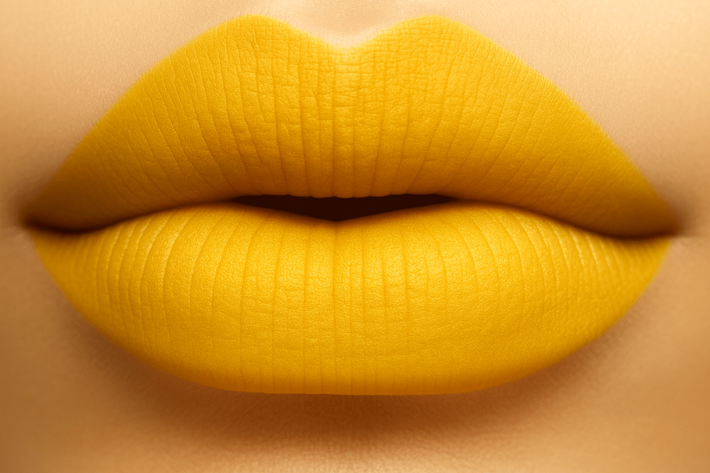
Porcelain had its own elite version as well, the Imperial Yellow glaze, a luminous egg yolk tone used only for the highest ranking pieces. This wasn’t just a color, it was a visual declaration of divine authority, stability, and cosmic order. Today Imperial Yellow still carries that sense of prestige and presence, but it’s no longer locked behind the palace walls. Designers now use it to signal warmth, confidence, and cultural depth.
Imperial Yellow isn’t just historically important. It’s also emotionally resonant. It’s the color of power but also somehow grounding. Representing earth in Chinese cosmology, it carries a stabilizing energy to it. It’s bold without the chaos. It symbolizes visibility and self permission. Considering only one person was allowed to wear it for centuries, wearing it now feels like reclaiming space for many. It’s stepping into your own authority and choosing to be seen brightly.
Since Imperial Yellow is a power player of a color, it comes as a surprise how versatile it is when paired with different colors. Deep blue’s pair beautifully and shows like its royal and magnetic. Blue somehow cools the heat of yellow and lets it shine all at once. Purples pair well and really bring a feeling of luxury. Greens really ground yellow and bring an earthy feeling. Warm neutrals, think camel or sand, soften the intensity of the yellow and make it modern and editorial.
Imperial Yellow is a storytelling color. Every time it’s used in a palette, a blog, a visual of some sort, you’re tapping into a power lineage of Emperors, artisans, philosophers, and makers. It’s emotionally warm unlike its sister colors of neon yellow and citrus tones. Imperial Yellow has depth. It feels like sunlight filtered through silk. It’s the color that speaks even louder than it shines. It’s cozy, it’s chaotic, it’s grounded, and bright.
XOXO,
Savi Monroe
