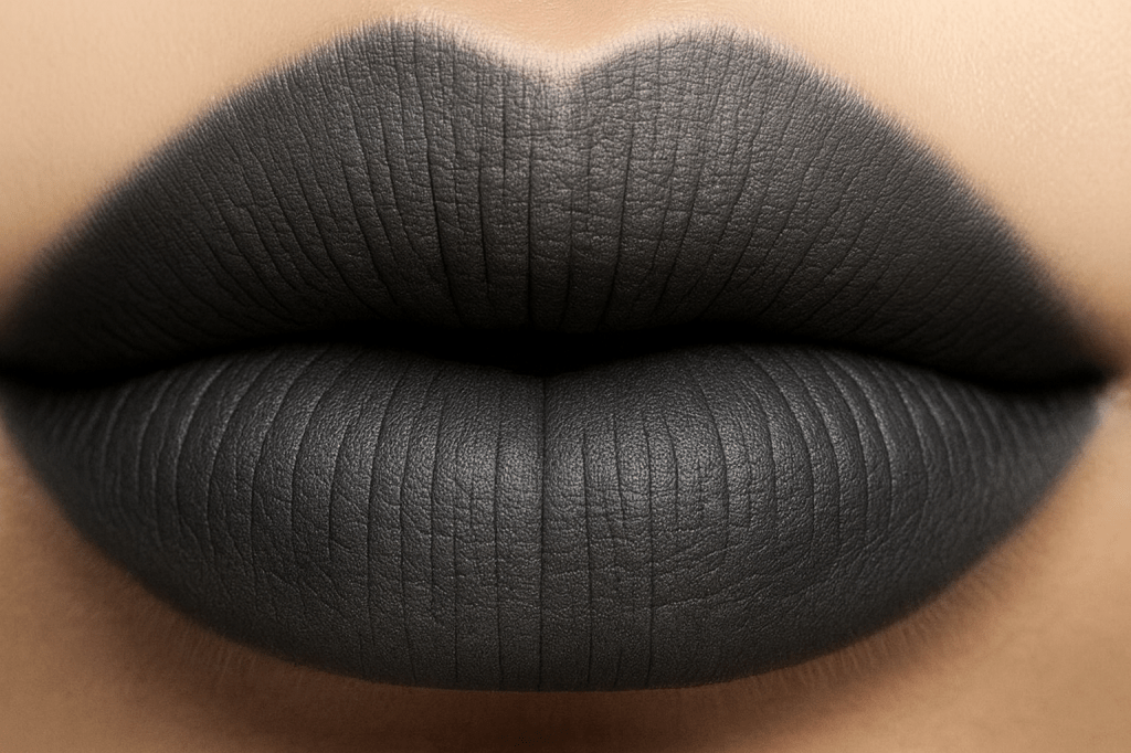
Charcoal is the color of containment. A color of clarity and says, “I’m here to protect my peace.” In a world that often demands sparkle and speed, charcoal is the visual pause. It’s the shade that says, “I’m not available for the chaos, but I am available for the truth.” Charcoal is the scaffolding behind your softness. It’s the emotional infrastructure that lets your lavender moments bloom safely.
The emotional architecture of charcoal is strong. Its emotional boundaries are firm but not cold. Its creative discipline doesn’t stifle, it supports. It’s a color of mystery with intention. It’s not hiding but choosing what to reveal. Charcoal is the color of pause before the powerful. It’s the visual equivalent of a locked door with a velvet rope. It’s elegant, secure, and not for everyone.
Charcoal doesn’t need to be loud to be felt. It’s the quiet authority in your creative life, the shade that grounds your sparkle. Charcoal is one of the colors that looks simple on the surface but is secretly loaded with history, symbolism, and quirky little facts that make charcoal more than just a “dark gray”. Charcoal’s name literally means “to burn”. It comes from the Old English word cearc. It ties the color directly to scorched wood. The name didn’t appear until the late 18th century, when people began using it to describe the smoky, sooty gray we know today.
Before charcoal was a color swatch, it was a drawing tool. Artists have used charcoal sticks for thousands of years all the way back to prehistoric cave paintings. It’s also tied to ancient fire rituals and early technology. Charcoal production dates back over 30,000 years which makes it one of humanity’s early technologies. Its visual identity, the matte smoky gray, is rooted in the earliest human relationship with fire.
Modern designers love charcoal because it’s easier on the eyes than black. In digital design, charcoal is often used instead of pure black because it creates softer contrast, reduces eye strain, and makes long form reading more comfortable. Charcoal also varies more than you think. Depending on the pigment mix, charcoal can lean into a blue gray for a cool industrial vibe. Green gray for an earthy slate like vibe. Designers also use it as a sign of sophistication and restraint. Since charcoal sits in the sweet spot between black and gray, it can be used to communicate seriousness, depth, and modernity which is why it dominates menswear, architecture, and minimalist design.
Charcoal also lays well with almost every color palette. I can’t really think of any color it doesn’t fit well with. It’s one of the most versatile neutrals. It can be paired with creams and warm whites. Fits perfect with cherry reds, mustards and ochres, soft greens, and metallics. From lavenders to burnt sienna or soft pinks and icy blues. Charcoal really should be staple in all closets. Charcoal is the emotionally secure best friend of your palette. It doesn’t compete, it complements. It lets your expressive colors shine while holding the emotional container.
Charcoal reminds us you don’t have to be loud to be clear. You don’t have to be sparkly to be powerful. Charcoal is the color of emotional containment. It holds magic without leaking it. Charcoal is the shade of saying no without explanation. It helps create structure for your creativity. Charcoal holds space for your own complexity. It chooses silence as a form of self-respect.
XOXO,
Savi Monroe

We use Kajal (kohl) in eyes to protect us from the “evil eye” 😉🖤.
LikeLike